
Print it digital, or give it an analog print character?
When you print your own design on DTF, the result splits broadly into two directions: keep it crisp and digital, or give it the character of an old analog print. HALFTONE can make both from one tool. This article explains the difference and how to choose.
First, run the same artwork through both and here’s how they differ.
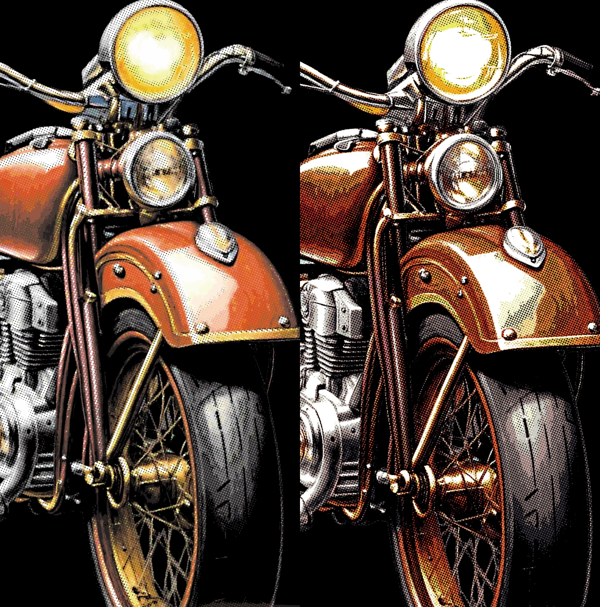
Digital halftone (crisp, faithful)
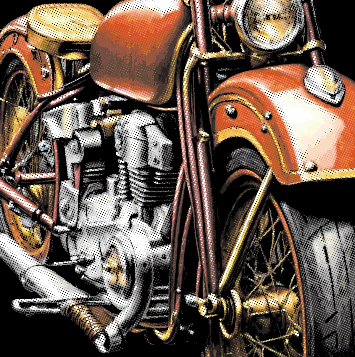
It converts the light and dark of your image into a regular grid of halftone dots, sized up and down. Dark areas get bigger dots, light areas smaller. It’s the same technique printing has used to reproduce photographs, done digitally.
The look is crisp, even, sharp. The dot spacing (line count) and angle are constant, with a mechanical precision. It stays faithful to your original digital image — “tidied up for printing without breaking it.”
It suits cases like these:
- Logos, line art, crisp 2–3 color graphics
- Gradients you want screened so DTF doesn’t band
- When you simply want the original art printed clean and faithful
Presets: “Standard,” “Fine detail,” “Coarse dots.”
Analog print character (recreated digitally)
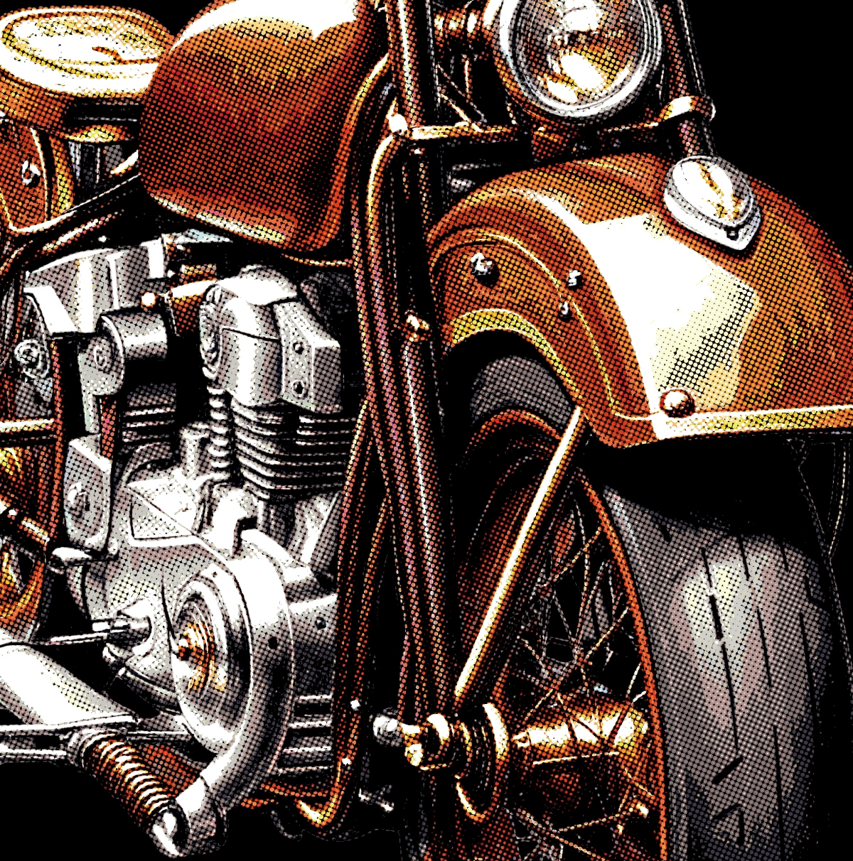
Rather than simply screening the image, it recreates an “old print” — multiple opaque inks layered on a dark garment. The core is building light up from black through continuous halftone tone. DTF is digital printing, but on top of it we recreate the analog print character.
The look is a faded, warm palette. Not too saturated, muted in tone. It carries the “character” of an old print — misregistration, break-up — uneven rather than uniform. There are no flat solid fills; the whole thing is built from halftone tone.
It suits cases like these:
- Photos, illustrations, painterly images
- When you want brand-new goods to look like a vintage thrift-store print
- When you want texture that comes from the printing method itself
Preset: “80s Vintage.”
The single biggest difference
| Axis | Digital halftone | Analog print character |
|---|---|---|
| Origin | Faithful to digital | Recreates an analog print |
| Look | Crisp, even, sharp | Faded, uneven, full of character |
| Attitude to the art | Tidies it faithfully | Deliberately breaks it into a “print” |
| Color | The original colors | A faded, warm palette |
| Best for | Logos, line art, crisp work | Photos, illustrations, painterly art |
| Target finish | A sharp DTF file | A vintage thrift-tee print character |
Which do you pick?
- Want it crisp and faithful — logos or line art → Digital halftone (Standard)
- Want a thrift-store, faded character — photos or illustrations → Analog print character (80s Vintage)
- Not sure? Try 80s Vintage first, and switch to Standard if it isn’t the look.
Try it
Once you know the finish you’re after, start from the door that fits. If you’re unsure, open both and compare.