
How that vintage tee “print character” is actually made
That vintage tee from the thrift store — the print slightly faded, dots showing, colors a touch out of register — a “character” new prints don’t have. It isn’t just random wear or aging: it comes from the printing method itself. Let’s look up close.
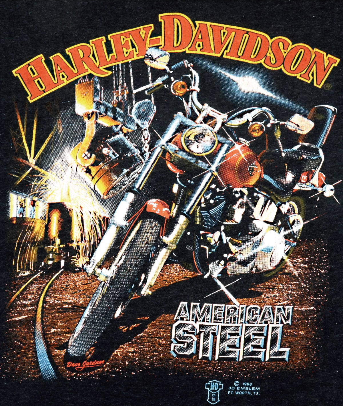
Up close, it looks like this.
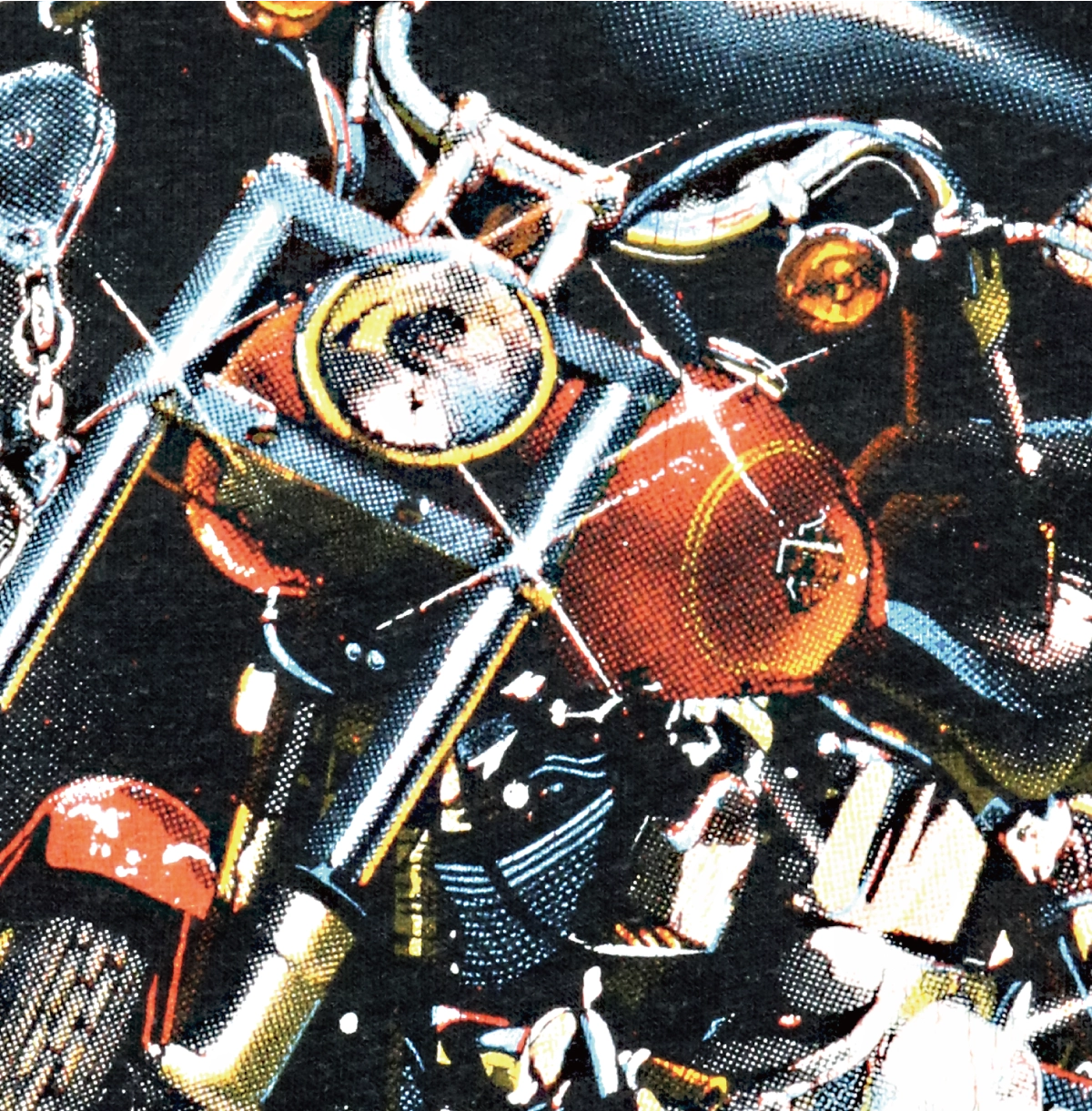
Everything you see has a name
This close-up holds the whole secret of that “character.”
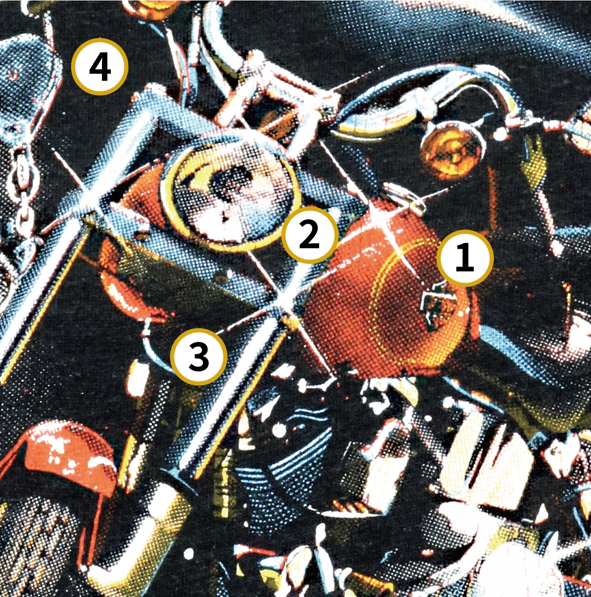
- ① Halftone dots (rosette) — the colors aren’t blended; tone is built from the size of the dots.
- ② Misregistration — the color screens sit slightly off, edges overlapping. Handmade unevenness.
- ③ Dot gain — on press the dots fatten, printing a little darker and muddier.
- ④ Fabric weave — the dots break over the weave of the cloth, a grain digital never has.
- Limited palette — a few opaque inks on a black ground. The faded color range is born here.
This is simulated process
This way of printing has a name: simulated process — reproducing a photographic image on dark fabric by layering a limited set of opaque inks as halftone dots. First a white underbase is laid down, then each color is screened on top as dots. It was the standard for band tees and artist tees in the ’80s and ’90s.
The key point: this is fundamentally a technique for printing a high-detail image on a dark garment — it isn’t an “aged” technique in itself. That “vintage character” is the aesthetic born from the by-products we just saw (dots, misregistration, dot gain, fabric weave, faded palette).
HALFTONE recreates this digitally
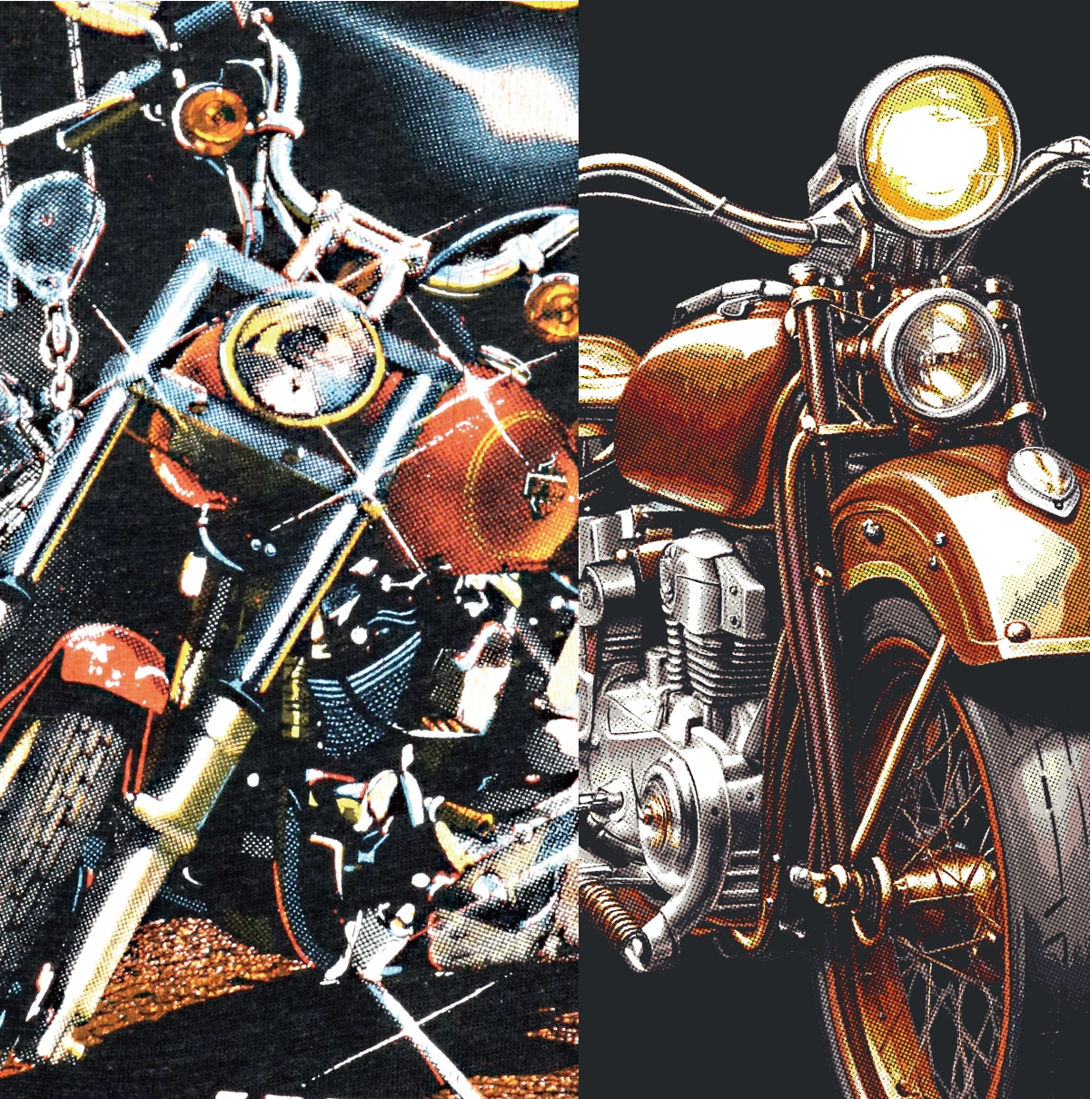
HALFTONE’s “80s Vintage” doesn’t actually screen-print; it recreates this print character on a digital file for DTF. The limited palette, the dots, the slight misregistration, the dot gain — all built by computation, giving a brand-new DTF print the texture of an old tee.
A digital tool that brings out the soul of an analog print. That’s this conversion.